
Pfizer DMP (Digital Marketplace)
Pfizer's Digital Service Team found their DMP (Digital Marketplace) checkout portal was viewed by users as difficult to navigate and lacking in user-friendly e-commerce conventions and patterns. With over 40 services for thousands of employees, it needed modernization to enhance usability. The (at the time) current flows were confusing and surfaced unnecessary information. They engaged our team to revamp the UX and UI of the tool, improving its functionality based on user feedback. The application was web-focused and did not include a mobile component. I served as the lead designer on this project.
Time: 16 weeks Tools: Sketch, Mural, Excel, Adobe DC
Problem
The client's service checkout tool was frequently cited as a major source of frustration for its users, ultimately driving them to seek design services from external vendors due to the tool's inefficiencies and limitations, increasing costs for the company. The client also felt the original system did not match regular e-commerce patterns.
Action
During the project, we embarked on conducting interviews with the current team to gather valuable insights. The team's feedback from actual users guided with modern e-commerce standards while ensuring it catered to their specific workflows and requirements.
Result
The client expressed satisfaction with the design phase of our collaboration, noting the successful implementation of the work on their end and an initial 30% increase in the purchasing of internal services. Their positive feedback highlighted the seamless communication throughout the process, underscoring the importance of a strong partnership in achieving shared goals.
Project Overview & Methods
Discovery & Research
Pfizer’s Digital Marketplace (DMP) was a challenge from the start. When I first encountered the platform, I immediately saw why users struggled—it was outdated, complex, and required too many steps to complete even the simplest tasks. I knew we had an opportunity to create something more intuitive and efficient.
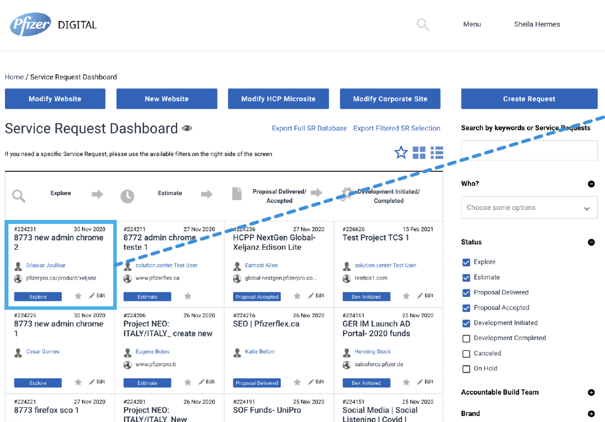

Selected Views of Original State
Discovery:
First, we received cross-disciplinary downloads on connected APIs and data sources and mapped out our understanding of the current content inventory on the original system. I tried to download as much information from these sessions as I could as at the time, these APIs integrations were new for me - I was unaware of Edison and PowerBi, but that wouldn’t last for long.
I carefully mapped out a content inventory on a component level and created some mockups to suggest small, granular updates to help give the client an overview of our future state thinking.
Interviews:
Before diving into design solutions, I needed to step into the users’ shoes. We held stakeholder interviews to help inform our user interviews. Our team carefully carried out group user interviews with 16 in groups of 3-4 users at a time to assist in deciphering our user's needs thoroughly.
I interviewed 3 of the 6 myself. These interviews helped our team acquire a deeper comprehension of their challenges with the platform. I found the answers to be insightful and the sessions served as the cornerstone for developing our personas. I created an Excel file to organize our research and used Mural to synthesize the research findings (sadly was lost when we switched to Miro!)

Our interview synthesis found the following results
The request process was confusing – too many steps, unclear instructions.
Tracking requests was inefficient, forcing users to send extra emails.
The interface felt cluttered, making it hard to find key actions quickly.
Didn’t match user’s mental models, making it hard to find key actions quickly.
Frequent email notifications created more noise rather than improving efficiency.
Lack of clarity – Confusing UI elements and inconsistent terminology.
Inefficient tracking – Users struggled to monitor request statuses.
Email overload – Excessive notifications cluttered communication.
Visual clutter – Outdated design made information hard to digest.
“There’s too much noise in the UI. I just need a simple way to submit and track requests.”
– Pfizer Digital Team Member
“The dashboard doesn’t help me quickly find what I need. It’s overwhelming.”
– External Vendor
To address these complaints, I made suggestions based on the synthesis:
Seamless experience with OST catalog website
Leverage existing systems
Increase service request (SR) status communication (eg, sometimes SRs don’t get updated in DMP despite jobs being produced, deployed)
Create finance/ops efficiency
Keep users from filling in dummy data (eg, SR numbers)
Personas:

List of Roles
Our timeline did not give us time to create detailed, graphic personas. We utilized the interview findings and stakeholder We also asked the client to provide us with a list of the entirety of the system’s user’s roles and continued regular stakeholder interviews to ensure we understood their flows.
User Flows:
The tasks required by users to navigate the system were complex. To streamline these tasks, I created user flows devised on user’s checkout flows, This also helped me hone in on the form-like structure of the system’s processes. Creating the user flows increased understanding of the original design and assisted in allowing the client to better understand my proposed process changes down the road.
User flow 1 - Initiating Service Request from DMP
User flow 2 - Modifying Existing Service Request
User flow 3 - Modifying Service Request From OST
Information Architecture:

First iteration of the Site map
The client readily accepted the re-design with minimal changes.
Design & Iteration
Lo-Fidelity Wireframe:
The original dashboard was information-dense and complex, potentially overwhelming users. I built low-s wireframes to explore different layouts and structures and adjust to stakeholder feedback quickly. My goal was to create a more modern layout that simplified the interface by reducing options, introducing better filter options and emphasizing a central search function. I focused on making components, such as the dashboard cards, more useful and easier to scan.
Hi-Fidelity Prototype:
The hi-fi design utilized Pfizer’s design library, helix, to create a soothing aesthetic. The icons and buttons/button states followed conventions, and the typography, while straightforward, felt slightly cramped. In contrast to the original version, the new designs embraces a modern, clean look with significantly more white space, which reduces visual clutter. The color palette remains cool-toned but incorporates darker hues to better delineate sections for radability, and card designs for individual items enhance readability and legibility.
Iteration:
I continued to iterate on the UI, making improvements from the first sprint.

User Testing & Iteration:
The client tested the redesign internally during implementation. The redesigned DMP made service requests more efficient and easier to track, with clear measurable improvements:
✅ 30% faster request submission times – Fewer steps, more intuitive flow.
✅ 25% fewer user errors – Users reported a much smoother experience.
✅ Higher engagement & adoption – Stakeholders were excited about the improvements.
“The UI is so intuitive now. I can submit a request without confusion.”
– External Vendor
“The new dashboard finally makes sense! Everything I need is right there.”
– Pfizer Marketer