Aside from my illustrious career in UX, my main passion is sound design and music. In this blog I'll talk about my recent experiences with the Novation Circuit synthesizer and how it's UX differs from that of other synthesizers. All photos courtesy Novation.
The Hills Are Alive…With The Sound of Human Factors
Meet the Novation Circut.

Often thought of as equal parts quirky, unique and frustrating, the circuit forgoes the menus found on most other synthesizers that are more than single sound machines. The Circuit offers a fascinating look at a product that forgoes traditional user expectations of what a synthesizer's interface should look like. This innovation in design leads to both breakthroughs and new pinpoints and it is worth a look at how the user experiences the machine.
THE GOOD
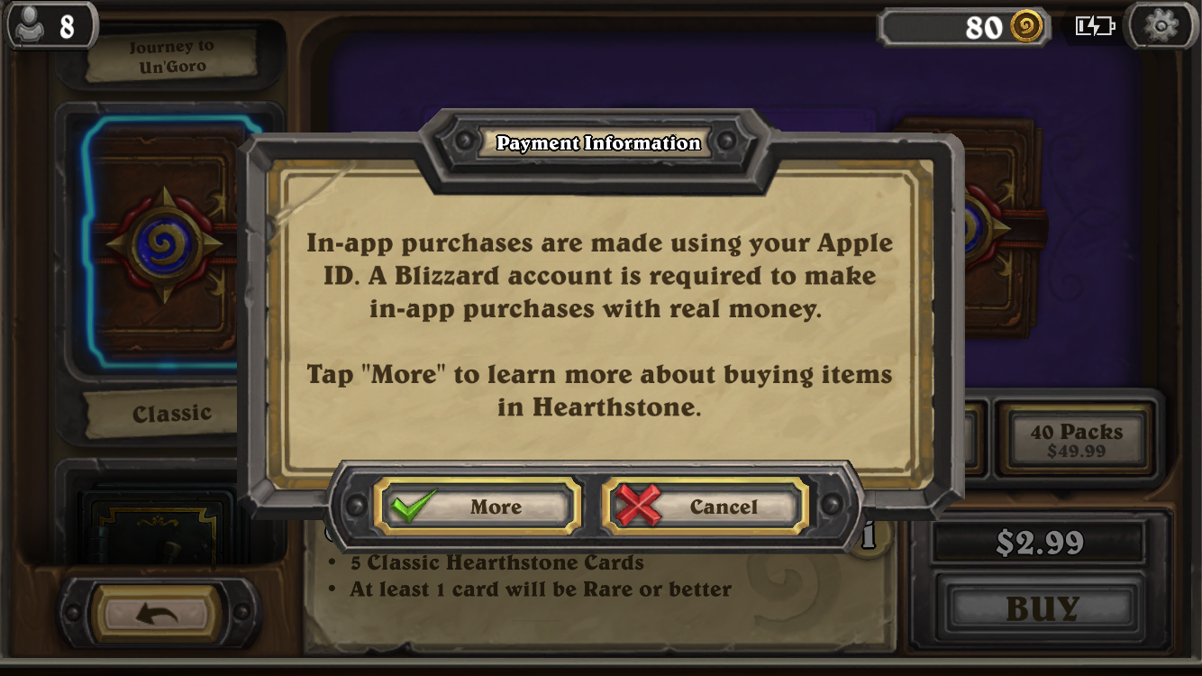
Let's start on a positive note. How can we, as UX designers, implement something that on the outside feels like a bad experience (being forced to fork over money to access additional features) and make it feel good for users? Believe it or not, it is possible\
Considerations
Goals
To produce a modern groove box that meets multiple consumer needs at a low price. The synthesizer market is small, but passionate and vocal.
Affordances
By forgoing an lcd menu and creating an innovative and unique color/pad based system, Novation was able to keep prices down. This kept the Novation Circut affordable.
Iteration
Novation has consistently released new features and met consumer requests via firmware updates. This constant iteration has created goodwill among Novation's audience, who regularly tout these updates as one of the main selling points of the unit.
Design
Novation made smart and deliberate design choices with the Circuit.
Five knobs to rule them all
Whereas a traditional sequencer or synthesizer has many parameters either within an LCD based menu or knob parameters on the device itself, the Circuit only has five. This simplifies the creations of synth patches/sounds and streamlines the user experience.
Portability
The circuit affords portability, an essential trait of a good groove box.
Look at the colors
The novation Circuit makes use of Multi
Accessibility
Due to the Circuit being pad/sequencer based, the system opens up music creation to users who may have difficulty coordinating a traditional keyboard and knob structure.

THE BAD
That's not to say the Novation Circuit is Perfect (does that rhyme?)
Design Disadvantages
Confusing User Experience
While the UI of the circuit encourages exploration, it does not follow the usual conventions of a synthesizer. This creates a new, different learning experience. Novation did their best to circumvent this pain point by making the system easy to use.
Tri-County Area
Due to the lack of an lcd panel in the UI, it is not always readily apparent what state the system is in. The user must rely on visual cues, which leads us to...
Accessibility Concerns
While the colored pads can help guide a user and the knobs help ease cognitive load, the system still requires care in accessing different states and the reliance on colors could be a hinderance to visually impaired users.