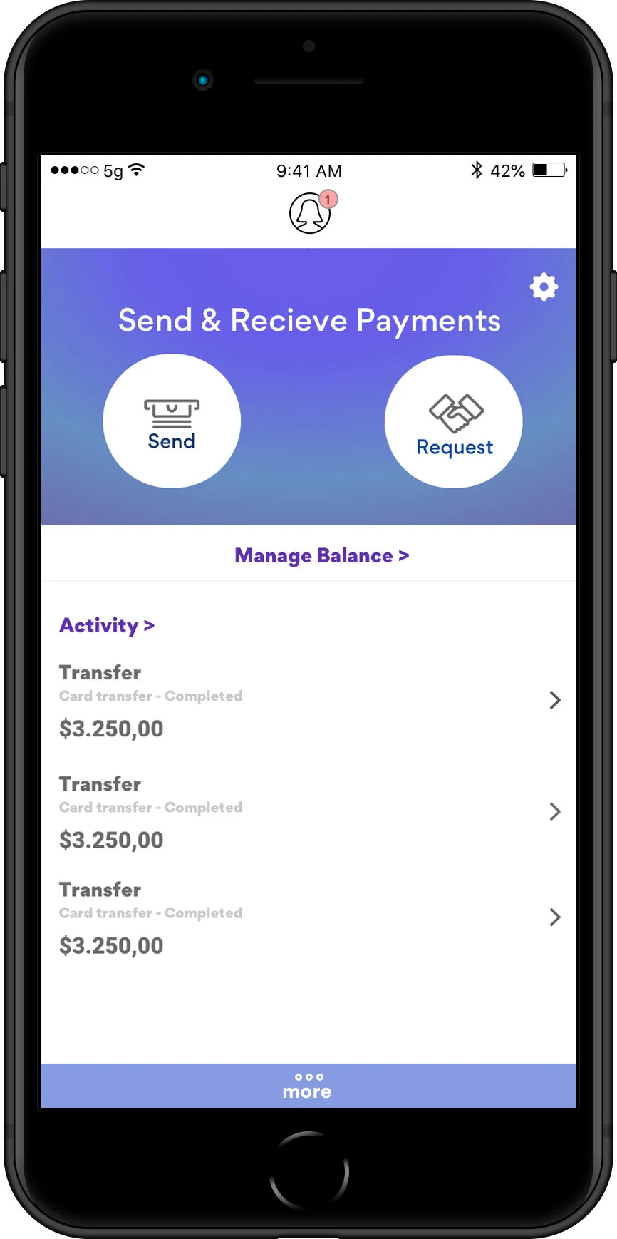
PayPal Onboard/Dashboard Redesign (spec)
The PayPal Speculative Redesign is a project I worked on in my own time to advance my skills in Sketch.
While I had used sketch in the past, I wanted to advance my skills with a concrete project.
This project consisted of a research stage, followed by development and implementation. All work is speculative and not for profit/for educational purposes only. Paypal and it’s branding are subject to their own copyright and this page will be taken down if asked.
Time: 30 Hours (including research + sketching) Tools: Sketch
Problem
How to solve update outdated on-boarding and branding issues in the fin-tech sphere
Action
Performed contextual inquiry of existing fin-tech apps
Result
Created Mid-fi wireframes that explored potential solutions to issues and updated colour scheme
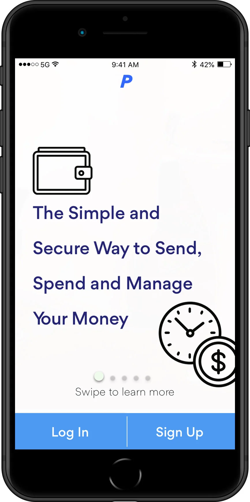
Original UI
Redesigned UI
-More accessible
-Friendlier
-cleaner
-More graphic
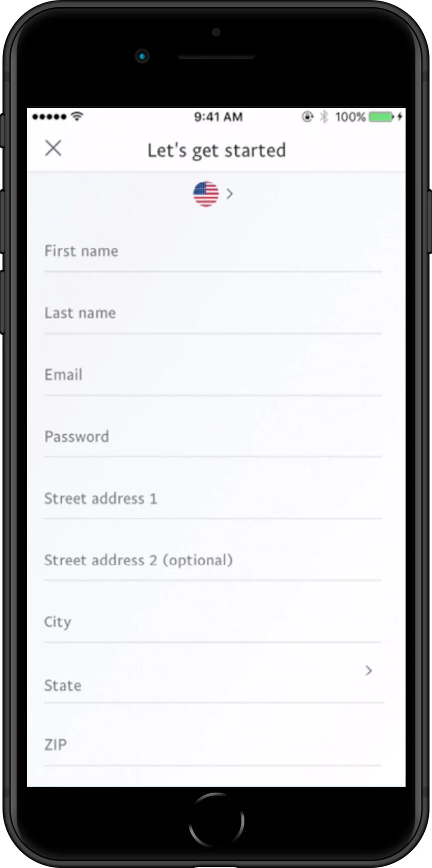
Original UI
- Fatiguing number of entry items
-Dated entry screen
Unnecessary country selection (can be automatic)
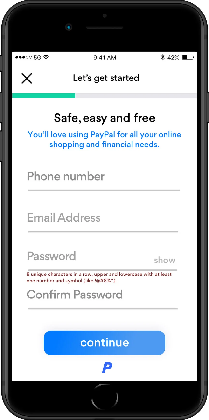
Redesigned UI
-Progress bar helps user know how far along onboarding process, to help retention
-Less elements helps user feel less overwhelmed, combating fatigue
-Motivational copy gives user reasoning to join and go through on-boarding process
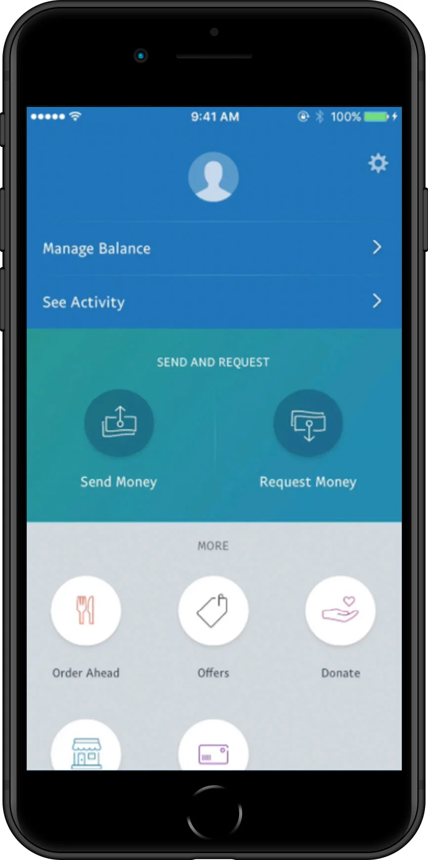
Original UI
- Dark
- Cluttered
Redesigned UI
-Notification on user icon
- User state and functionality more clearly defined
- Use of negative/white space


